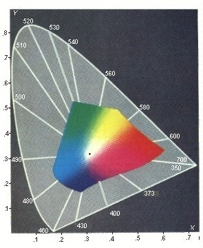
 Another thing to note about the modified CEI
chromacity diagram to the right is that it represents the colors attainable
with modern printing inks, not the visible spectral colors.
Another thing to note about the modified CEI
chromacity diagram to the right is that it represents the colors attainable
with modern printing inks, not the visible spectral colors.
Finally, the diagram only depicts the one and only
Visible Spectral, S11. All the other spectrals
should have all their colors subdued to indicate they have no visible colors.
That is if there is any point in diagraming any of the other spectrals.
I have detailed the
standard CEI System and how to use it, elsewhere at this site. This brings
up the fact that up to now I have been concentrating on only one of the three
properties of color, its Hue. Color has two more properties,
Intensity, and Chroma.
A color's hue is its wavelength. A color's Intensity is measured as the magnitude
of the electromagnetic disturbance or light wave.

